Nature Spotting Exhibition Branding
Brand Identity | Typography
2024
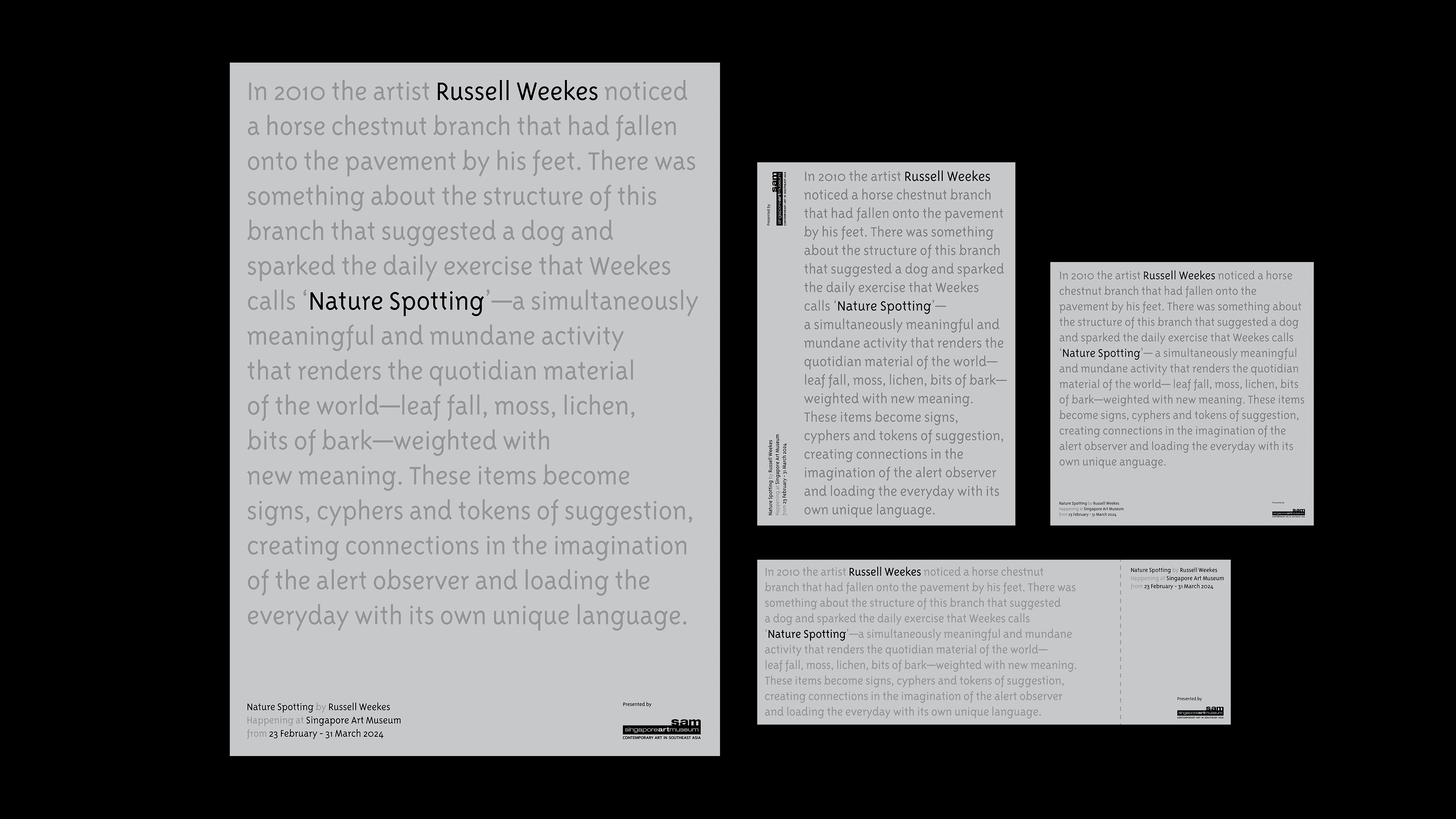
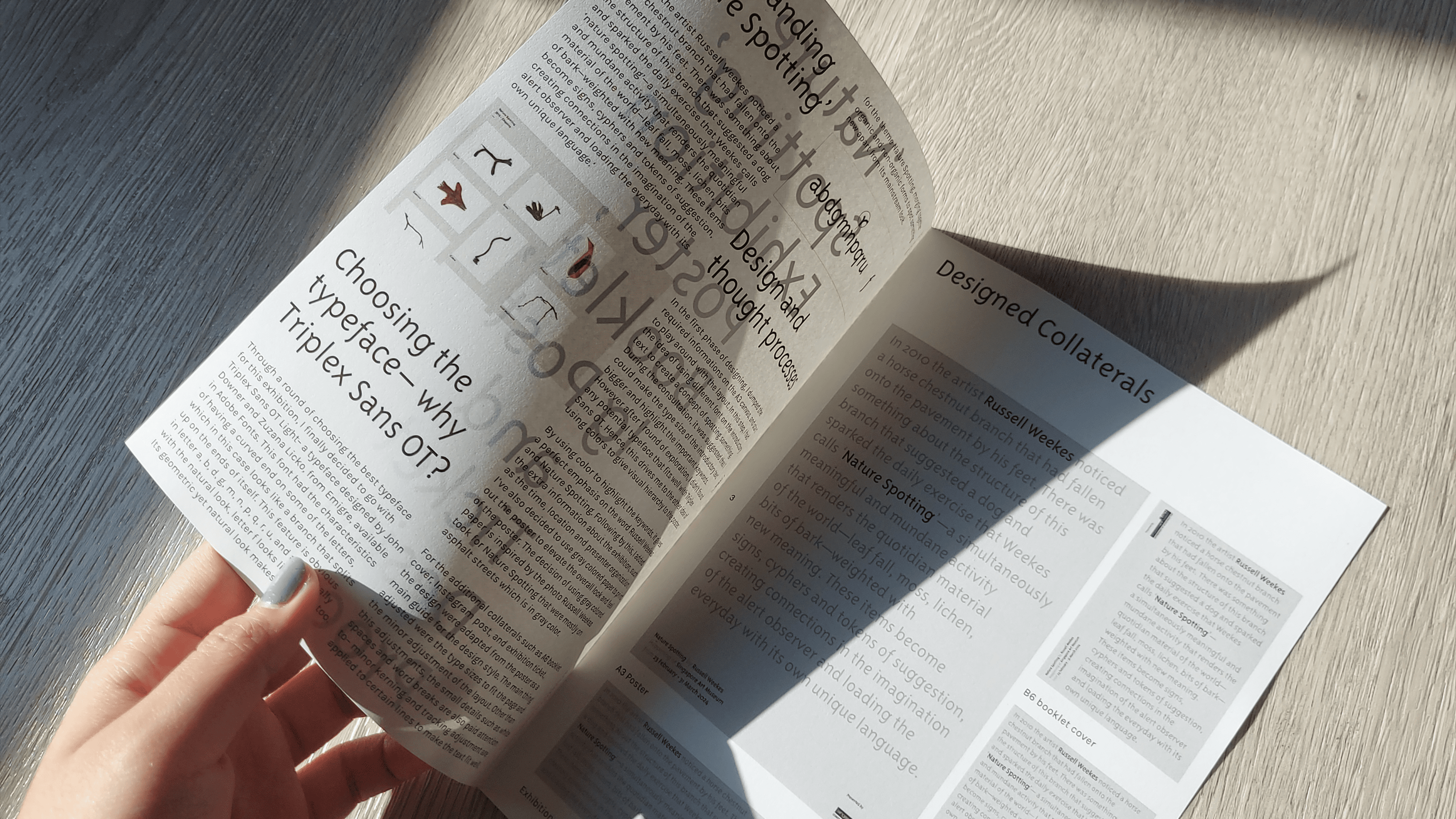
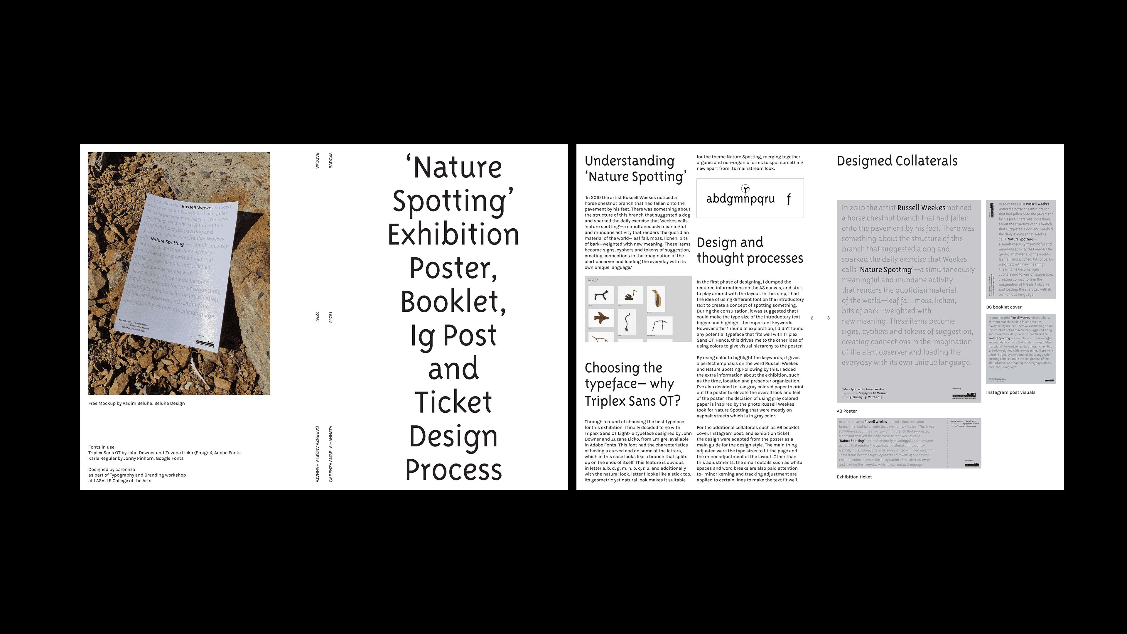
This project explores the typography and visual identity for a semi-fictional exhibition, Nature Spotting, an on-going photography project by Rusell Weekes. The typeface chosen for this semi-fictional exhibition is Triplex Sans OT designed by John Downer and Zuzana Licko, from Emigre, available in Adobe Fonts. This font had the characteristics of having a curved end on some of the letters, which in this case looks like a branch that splits up on the ends of itself. This feature is obvious in letter a, b, d, g, m, n, p, q, r, u, and with the natural look of letter f, it looks like a stick. Its geometric yet natural look makes it suitable for the theme Nature Spotting, merging together organic and non-organic forms to spot something new apart from its mainstream look.